Introduction
Imagine visiting a website on your smartphone only to find tiny text, broken layouts, and buttons that are impossible to tap. Chances are you'll leave within seconds and look for an alternative.
This scenario highlights a common issue faced by businesses with outdated websites. As users increasingly access websites through smartphones, tablets, laptops, and smart devices, websites must provide a seamless experience across every screen size.
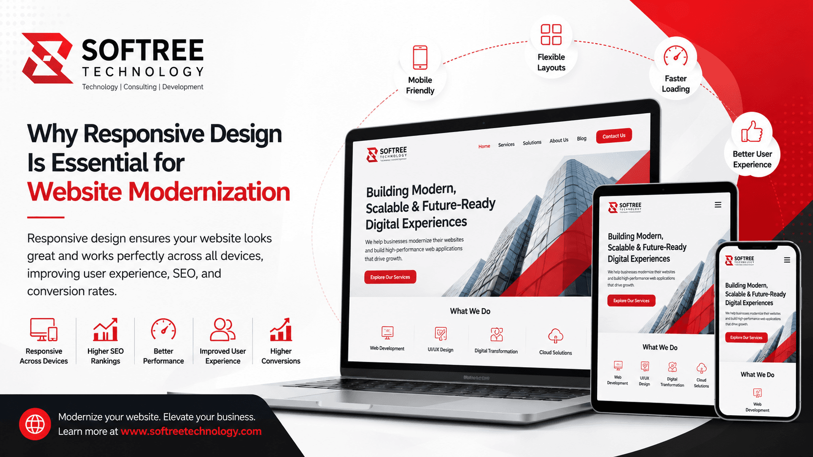
Responsive web design has become a fundamental component of website modernization. It ensures websites automatically adapt to different devices, creating consistent experiences that improve engagement, search visibility, and conversion rates.
In this article, you'll learn what responsive design is, why it's critical for modernization initiatives, how it works, and best practices for implementation.
Quick Answer
Responsive web design is an approach that allows websites to automatically adjust layouts, images, and content based on screen size and device type. It is essential for website modernization because it improves user experience, supports mobile-first browsing, enhances SEO performance, and increases conversion opportunities.
Table of Contents
- What Is Responsive Web Design?
- Why Responsive Design Is Important for Website Modernization
- How Responsive Design Works
- Key Components of Responsive Websites
- Benefits of Responsive Design
- Common Use Cases
- Best Practices
- Common Mistakes to Avoid
- Frequently Asked Questions
- Key Takeaways
- Conclusion
What Is Responsive Web Design?
Responsive web design is a development approach that enables websites to adapt automatically to different screen sizes, resolutions, and devices.
Rather than creating separate websites for desktop and mobile users, responsive design uses flexible layouts, scalable images, and media queries to deliver a consistent experience from a single codebase.
This approach ensures users can easily read content, navigate pages, and interact with features regardless of the device they use.
Overview
Modern responsive websites:
- Automatically adjust layouts
- Resize images dynamically
- Optimize navigation for touch devices
- Improve readability across screens
- Maintain consistent branding
Context
With mobile traffic accounting for a significant share of global internet usage, responsive design is no longer optional. It has become a standard requirement for organizations pursuing website modernization.
Why Responsive Design Is Important for Website Modernization
Enhances User Experience
User experience is one of the primary goals of website modernization. Responsive websites eliminate frustrating interactions such as excessive zooming, horizontal scrolling, and difficult navigation.
Visitors can access content quickly and comfortably on any device.
Supports Mobile-First Behavior
Consumers increasingly browse, research, and purchase products using smartphones. Responsive design ensures websites meet the expectations of mobile users.
Improves Search Engine Rankings
Search engines prioritize mobile-friendly websites. Responsive design helps improve crawlability, usability, and technical SEO performance.
Increases Conversion Rates
A smooth and consistent user experience encourages visitors to complete actions such as purchasing products, submitting forms, or contacting businesses.
How Responsive Design Works
Responsive web design relies on flexible technologies that adapt content to different screen sizes.
Step 1: Flexible Grid Layouts
Developers use percentage-based grids instead of fixed-width layouts, allowing content to scale naturally.
Step 2: Media Queries
CSS media queries detect screen dimensions and apply specific styles based on device characteristics.
Step 3: Flexible Images and Content
Images, videos, and content blocks automatically resize to fit available screen space.
Responsive Design Workflow
User Opens Website ↓ Device Screen Detected ↓ Media Queries Activated ↓ Layout Adjusts Automatically ↓ Images and Content Resize ↓ Optimized User Experience
Key Components of Responsive Websites
Flexible Layouts
Responsive layouts adapt to various screen dimensions without breaking content structure.
Adaptive Images
Images automatically scale to maintain quality and performance across devices.
Mobile-Friendly Navigation
Menus and navigation systems are optimized for touch interactions and smaller screens.
Fast Performance
Responsive websites prioritize loading speed and efficient resource delivery.
Benefits of Responsive Design
Better User Experience
Users enjoy consistent experiences regardless of device type.
Improved SEO Performance
Mobile-friendly websites align with modern search engine requirements.
Increased Conversion Opportunities
Responsive interfaces reduce friction during customer journeys.
Simplified Website Management
A single responsive website is easier to maintain than separate desktop and mobile versions.
Future-Proof Architecture
Responsive design helps websites remain adaptable as new devices and screen sizes emerge.
Common Use Cases
Corporate Websites
Organizations use responsive design to ensure accessibility for customers across multiple devices.
E-Commerce Platforms
Online retailers improve product discovery, browsing, and checkout experiences through responsive layouts.
Educational Portals
Schools and universities provide students with seamless access to information from any device.
Healthcare Websites
Healthcare providers enable patients to access services, appointments, and information conveniently on mobile devices.
Best Practices
Adopt a Mobile-First Design Strategy
Design for smaller screens first before expanding layouts for larger devices.
Optimize Images and Media
Use modern image formats and responsive image techniques to improve performance.
Prioritize Readability
Ensure text remains legible across all screen sizes without requiring zooming.
Test Across Multiple Devices
Validate website functionality using smartphones, tablets, laptops, and desktop monitors.
Monitor Performance Metrics
Track page speed, Core Web Vitals, and user engagement to identify improvement opportunities.
Common Mistakes to Avoid
Designing Only for Desktop Users
Ignoring mobile users can negatively impact engagement and conversions.
Using Fixed Layouts
Fixed-width designs often fail to adapt properly across devices.
Overloading Mobile Pages
Large images and excessive scripts can slow mobile performance.
Ignoring Touch Interactions
Buttons and navigation elements should be optimized for finger taps rather than mouse clicks.
Conclusion
Responsive web design is no longer a feature that organizations can treat as optional—it is a fundamental requirement for successful website modernization. As users increasingly access websites from smartphones, tablets, laptops, and emerging digital devices, businesses must deliver seamless and consistent experiences across every screen size.
A well-executed responsive design strategy improves user engagement, enhances accessibility, supports search engine optimization efforts, and creates more opportunities for conversions. It also provides organizations with a scalable foundation that can adapt to future technology changes and evolving customer expectations.
For businesses planning a website modernization initiative, responsive design should be a core priority rather than an afterthought. By combining mobile-first design principles, performance optimization, and modern web development frameworks, organizations can create digital experiences that are faster, more user-friendly, and better aligned with today's digital landscape.
At Softree Technology, we help organizations modernize legacy websites and build high-performance web applications using modern technologies such as React, Next.js, and scalable cloud architectures. Our approach focuses on delivering responsive, secure, and future-ready digital experiences that support long-term business growth and evolving customer needs.
Learn more about website modernization and custom web application development services at https://www.softreetechnology.com/