Power BI Dashboard Design: Best Practices for Enterprise Analytics
Introduction
Power BI dashboard design has become an important part of modern enterprise analytics. Organizations collect data from multiple systems, departments, and business processes, but having access to large volumes of data does not automatically lead to better decisions. The real challenge is presenting that information in a way that helps users quickly understand performance, identify problems, and take action.
For enterprise teams, dashboards need to do more than display charts and KPIs. They must provide a clear information hierarchy, reliable metrics, intuitive navigation, strong performance, accessibility, and appropriate governance. When these elements are missing, users may struggle to identify important insights, question KPI accuracy, or return to spreadsheets and manual reporting.
A well-designed Power BI dashboard connects business questions with trusted data and actionable insights. This guide explains the common challenges organizations face, how to approach enterprise dashboard design, where Power BI can be applied, and the best practices that can make dashboards more scalable, usable, and business-focused.
Why Do Enterprise Power BI Dashboards Often Fail to Deliver the Expected Value?
Many organizations have invested in Power BI and modern data platforms but still experience challenges when converting data into decisions. The issue is often not the availability of data but how that data is structured, presented, governed, and consumed.
Too many KPIs can create information overload, while inconsistent dashboard layouts across departments make enterprise reporting difficult to compare. Poor visual hierarchy can force users to search for important information, and unclear filters can make it difficult to understand the context behind a displayed metric.
Performance is another common concern. As data volumes increase, reports with inefficient calculations, excessive visuals, or expensive interactions can become slower. When dashboards are difficult to use or slow to load, users may return to spreadsheets or request manual exports even when the required information is already available in Power BI.
Different teams may also calculate or interpret the same KPI differently because of duplicated calculations and unmanaged datasets. This creates conflicting reports and reduces trust in enterprise analytics.
What Does Poor Dashboard Design Look Like?
Common warning signs include:
- Users requesting manual exports despite having dashboards.
- Executives needing multiple pages to answer basic performance questions.
- Different departments reporting different values for the same KPI.
- Dashboard pages containing too many charts with little prioritization.
- Slow interactions as data volume and report complexity increase.
- Unclear filter states that make KPI interpretation difficult.
- Reports that provide too much detail without considering user roles.
The source also illustrates four major dashboard design priorities: business clarity, usability, performance, and governance. Its example assigns 30% to business clarity, 28% to usability, 22% to performance, and 20% to governance. These percentages are illustrative rather than industry benchmark figures.
What Are the Key Principles of Effective Power BI Dashboard Design?
The most effective dashboards begin with the decisions users need to make rather than the charts available in Power BI.
Key principles include:
- Define business questions before selecting visuals.
- Prioritize decision-critical KPIs.
- Establish consistent KPI definitions and ownership.
- Create a clear visual hierarchy.
- Design navigation around user roles and workflows.
- Use reusable semantic models and governed measures.
- Optimize performance using realistic enterprise data volumes.
- Make filters and interactions intuitive.
- Design for accessibility and usability.
- Establish governance, security, deployment, and ownership processes.
These principles help organizations move from dashboards that simply display information to analytics experiences that support real business decisions.
How Should Enterprises Approach Power BI Dashboard Design?
A scalable dashboard strategy should connect business objectives, information architecture, semantic modeling, visualization, performance, and governance. The objective should be to create a decision experience rather than simply a collection of charts.
How Should You Start With Business Users and Their Questions?
The first step is to identify who will use the dashboard. Executives may require a concise overview of business performance, while managers may need trends and drivers. Analysts may require deeper exploration, and operational teams may focus on exceptions, capacity, or service-level performance.
After identifying the users, define the business questions the dashboard needs to answer. Each major visual should support a specific question or action.
How Should You Prioritize KPIs?
Not every available metric belongs on the first dashboard screen. Organizations should identify the KPIs that directly support business decisions and define their owners, calculation rules, targets, thresholds, and business meaning.
A shared KPI definition also helps prevent different departments from reporting different values for the same business metric.
How Should You Structure the Dashboard Layout?
A strong information hierarchy should move users from summary information toward deeper analysis.
The recommended structure is:
Summary KPIs → Trends → Drivers → Exceptions → Detailed Analysis
This approach keeps the first view focused while still giving users controlled access to additional information when deeper analysis is required.
How Important Is the Semantic Model to Dashboard Design?
The semantic model provides the foundation for consistent reporting. Reusable dimensions, appropriate relationships, governed measures, and standardized business definitions can reduce duplicated logic and improve consistency across dashboards.
Separating the semantic model from the presentation layer also makes it easier to reuse trusted calculations across multiple reports.
How Should Visuals and Interactions Be Selected?
Visuals should be selected according to the analytical question they answer.
Line charts are useful for trends, bar charts work well for comparisons, and tables or matrices are appropriate when users need exact values. Maps should only be used when geographic information adds meaningful analytical context. Pie and donut charts should be used selectively when there are relatively few categories and part-to-whole comparison is important.
Interactions such as slicers, drill-through, bookmarks, tooltips, and cross-filtering should be used when they improve the user journey rather than simply because they are available.
How Can Power BI Dashboard Design Be Implemented Across an Enterprise?
Enterprise dashboard development should follow a structured implementation process rather than moving directly from requirements to report development.
What Should Happen During Discovery?
The discovery phase identifies stakeholders, user personas, business questions, KPIs, existing reports, and current reporting challenges.
How Should the Dashboard Architecture Be Designed?
The information architecture phase establishes page structure, navigation, dashboard hierarchy, wireframes, and interaction patterns before development begins. This helps teams validate the user experience before investing heavily in implementation.
How Should Data and Semantic Models Be Prepared?
Data sources, relationships, dimensions, measures, security requirements, refresh requirements, and reusable model components should be reviewed before dashboard development.
How Should the Dashboard Be Developed and Tested?
The development phase applies approved visual standards, templates, filters, drill-through functionality, tooltips, and interaction patterns.
Testing should cover:
- Data accuracy
- Query performance
- Refresh reliability
- Security
- Accessibility
- Usability
- Realistic enterprise data volumes
The implementation should then move through controlled deployment, governance, user training, monitoring, and continuous improvement.
Where Can Enterprises Use Power BI Dashboards?
Power BI dashboards can support different departments by presenting information according to specific business objectives and workflows.
How Can Executives Use Power BI Dashboards?
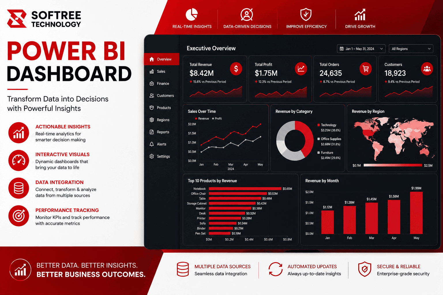
Executive dashboards can provide a concise view of revenue, margin, growth, customer health, operational KPIs, and exceptions. The focus should be on helping leadership understand overall business performance quickly.
How Can Sales Teams Use Power BI?
Sales dashboards can monitor pipeline coverage, win rates, sales performance, territory trends, quota attainment, and forecast accuracy.
How Can Finance Teams Use Power BI?
Finance dashboards can provide visibility into budget versus actuals, cash flow, profitability, cost drivers, and financial variance analysis.
How Can Operations Teams Use Power BI?
Operations dashboards can track volume, capacity, SLA performance, throughput, backlog, and operational exceptions.
How Can Supply Chain Teams Use Power BI?
Supply chain dashboards can monitor inventory levels, supplier performance, delivery reliability, demand trends, and logistics exceptions.
How Can Customer Service and HR Teams Use Power BI?
Customer experience dashboards can monitor satisfaction, service volumes, response times, retention, and complaint trends.
HR dashboards can provide visibility into headcount, attrition, hiring pipelines, workforce mix, and workforce planning metrics.
How Can Enterprises Measure the ROI of Power BI Dashboards?
Dashboard success should be measured through business outcomes rather than the number of charts or pages created.
Organizations can establish a baseline for:
- Report preparation time
- Time to insight
- Dashboard adoption
- Data-quality incidents
- Refresh reliability
These measures can help determine whether dashboards are reducing manual reporting effort, improving decision speed, increasing adoption, and improving confidence in shared KPIs.
Well-designed dashboards can help reduce repetitive spreadsheet preparation, improve operational visibility, increase adoption of governed analytics, and support faster decision-making. However, the actual ROI depends on factors such as reporting effort, user population, data complexity, and the business outcomes being measured.
What Are the Best Practices for Designing Better Power BI Dashboards?
How Can You Create a Clear Visual Hierarchy?
Place high-priority information in predictable locations. Use KPI cards for headline metrics and supporting visuals for trends, drivers, and exceptions.
Whitespace should separate sections and reduce visual noise. Avoid adding visuals simply to fill available dashboard space.
How Should Filters Be Designed?
Group related slicers and use business-friendly labels. Frequently used filters should remain easy to access, while advanced filters can be positioned in secondary areas.
The current filter state should always be visible so users understand the context behind the numbers they are viewing.
How Can You Improve Power BI Dashboard Performance?
Performance should be considered from the beginning of development. Organizations should use efficient semantic models, reduce unnecessary visuals and expensive interactions, review relationships and measures, and test reports with realistic enterprise data volumes.
How Can You Make Power BI Dashboards More Accessible?
Use readable font sizes, sufficient contrast, descriptive titles, and meaningful labels. Do not rely on color alone to communicate meaning, and provide alternative textual context where appropriate.
Navigation and interaction behavior should also remain predictable for users.
How Can Enterprises Standardize and Govern Power BI Dashboards?
Organizations should establish reusable page templates, design guidelines, shared KPI dictionaries, metric ownership, controlled deployment, workspace governance, security controls, and lifecycle processes.
Usage analytics can also help identify which dashboards continue to provide business value and which reports should be improved or retired.
What Does the Future of Enterprise Power BI Dashboard Design Look Like?
Enterprise analytics is moving toward more scalable, governed, and intelligent reporting environments. Organizations need dashboards that can work with growing data volumes while maintaining consistent metrics, reliable performance, and intuitive user experiences.
The foundation for this evolution includes reusable semantic models, governed measures, standardized design patterns, efficient data models, performance testing, controlled deployment, and clear ownership.
AI is also expanding how users interact with analytics. Softree's Power BI content highlights the movement toward AI-assisted insights, forecasting, and conversational experiences within dashboards.
This means future dashboard design will increasingly focus not only on showing what happened, but also on helping users understand why performance changed, identify emerging patterns, and support faster decisions.
What Should Enterprises Remember About Power BI Dashboard Design?
Power BI dashboard design is most effective when it starts with business decisions rather than visual elements. A dashboard should make important information easier to find, understand, and act upon.
The strongest enterprise approach combines user-focused design, governed semantic models, clear KPI definitions, appropriate visualizations, efficient performance, accessibility, security, and continuous improvement.
For organizations building enterprise analytics solutions, Softree Technology provides Power BI capabilities covering data connectivity, data transformation, data modeling, DAX and analytics, interactive reports and dashboards, deployment, and continuous optimization.
Conclusion
A successful Power BI dashboard is more than a collection of charts. It is a structured decision-support experience that connects trusted data with the people and business processes that depend on it.
Enterprises should begin by understanding their users and defining the questions the dashboard must answer. From there, they can prioritize KPIs, establish a clear information hierarchy, build reusable semantic models, select visuals based on analytical needs, optimize performance, and introduce governance and security controls.
The implementation process should not end when a dashboard is published. Adoption, performance, data quality, refresh reliability, and user feedback should continue to be monitored so dashboards can evolve with changing business requirements.
With the right approach, Power BI can help organizations move from fragmented reporting and manual analysis toward a more consistent, scalable, and business-focused analytics environment. Softree Technology supports organizations in designing and implementing Power BI solutions that connect enterprise data with actionable insights and scalable reporting workflows.
If your organization is planning to improve its Power BI dashboards or build an enterprise analytics solution, Softree Technology can help you design and implement a solution aligned with your business requirements.